
Portable design systems
Use rule files to make your prototypes look like your company's app

Struggling to make your code-generated design prototypes look like your own app? Try applying a “portable design system”.
Success with generative AI comes down to providing quality context.
Engineers who successfully work with Cursor and Claude Code maintain detailed documentation and instructions for the AI to adhere to their personal or organization’s style, sensibilities, and guidelines about how their code must be written, organized, and validated.
These documented rules are captured in simple text files, written in natural language, and structured using Markdown.
Most code-gen tools support some version of this documentation, including Cursor (“rules”), Bolt (“knowledge”), Lovable (“knowledge”), v0 (“custom instructions”), and Figma Make (“guidelines”).
It hit me that designers and product managers can use the same idea to create what I’m calling a “portable design system”: a single rules file that describes your design tokens, key components, and UI copy guidelines—portable because you can reuse the same file across many code-gen services.
What is a design system other than a set of rules, guidelines, and suggestions for how an application’s design and interactions should look and feel?
What does a portable design system look like?
The goal is to provide clear, concrete, and concise instructions that represent your design system. This includes, but is not limited to:
Design tokens for colors, typographic styles, spacing, etc.
Component definitions (e.g., buttons, selection lists) for style, variations, interactions, and use cases
UX copy guidelines for style, tone, and voice
Any other rule you’d like to enforce (e.g., OK before Cancel)
The portable design system captures as many of these details as plain text. There’s no perfect way to structure this—experiment and use whatever format best matches the source material you have.
How to create it
Get yourself a good genAI tool, like Cursor
The best way I’ve found to recreate a design system is to use a high-quality tool like Cursor. I’ll usually create a new directory (e.g.,portable_ds), open that folder in Cursor, and start with a prompt like this:
I want to create a rules file that documents an app’s design system (i.e. design tokens, components, etc) in markdown format.

The sections are:
- Color tokens
- Typographic tokens
- Spacing tokens
- Radius tokens
- Other design tokens
- Components
- UI copy guidelines

The goal is to concisely summarize the details. GenAI tools will use these instructions to inform the design direction of generated apps.

Build me an empty shell.
Identify your source material, starting with design tokens
You’ll need to feed Cursor source material that represents your design system. In the past I’ve used my company’s (Pendo’s) component library Figma file. Not only does it include our styles and components, it also includes pages and frames with examples and variations.Feed your source material to Cursor
Do this section by section (e.g., color tokens, typographic tokens). There are two common ways to provide this information:Using Figma’s official MCP server (check Figma’s MCP documentation if this is your first time using it)
Exporting an image of a Figma frame and passing that into the prompt
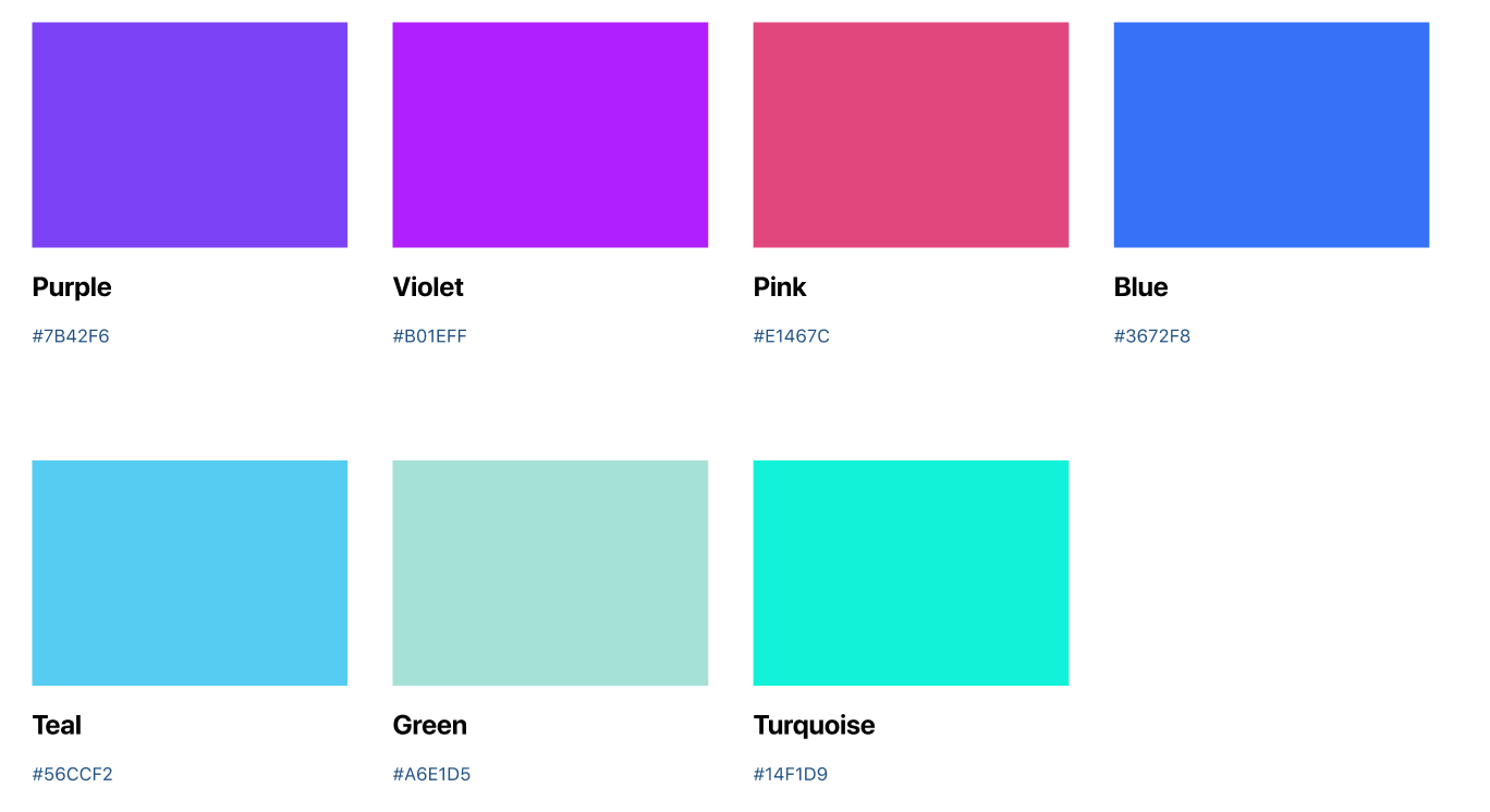
Example of color swatches from a Figma library I’ll typically use both methods. Direct access to designs via MCP should be the most reliable, but image comprehension is good enough that you may not need MCP for many cases.
Let’s say I’m working with a Figma component library. I’ll go to a page with styles or components I want to capture, identify the frame that includes the information, and either:
copy the frame’s URL (Cmd–L) if I’m using the Figma MCP, or
copy the frame as a PNG (Shift–Cmd–C)
Then I’ll prompt Cursor with something like:

Add the color tokens found in this Figma frame ([Link to Figma frame]) or based on the attached image.
Verify and repeat
After Cursor generates content for your.mdfile, review the output and verify the results. If you find mistakes, correct them by hand or re-prompt with the same image/Figma URL. If the original frame is big, try chunking it up with zoomed-in screenshots.
Once tokens look solid, continue through the remaining token sections.Move on to components (keep it pragmatic)
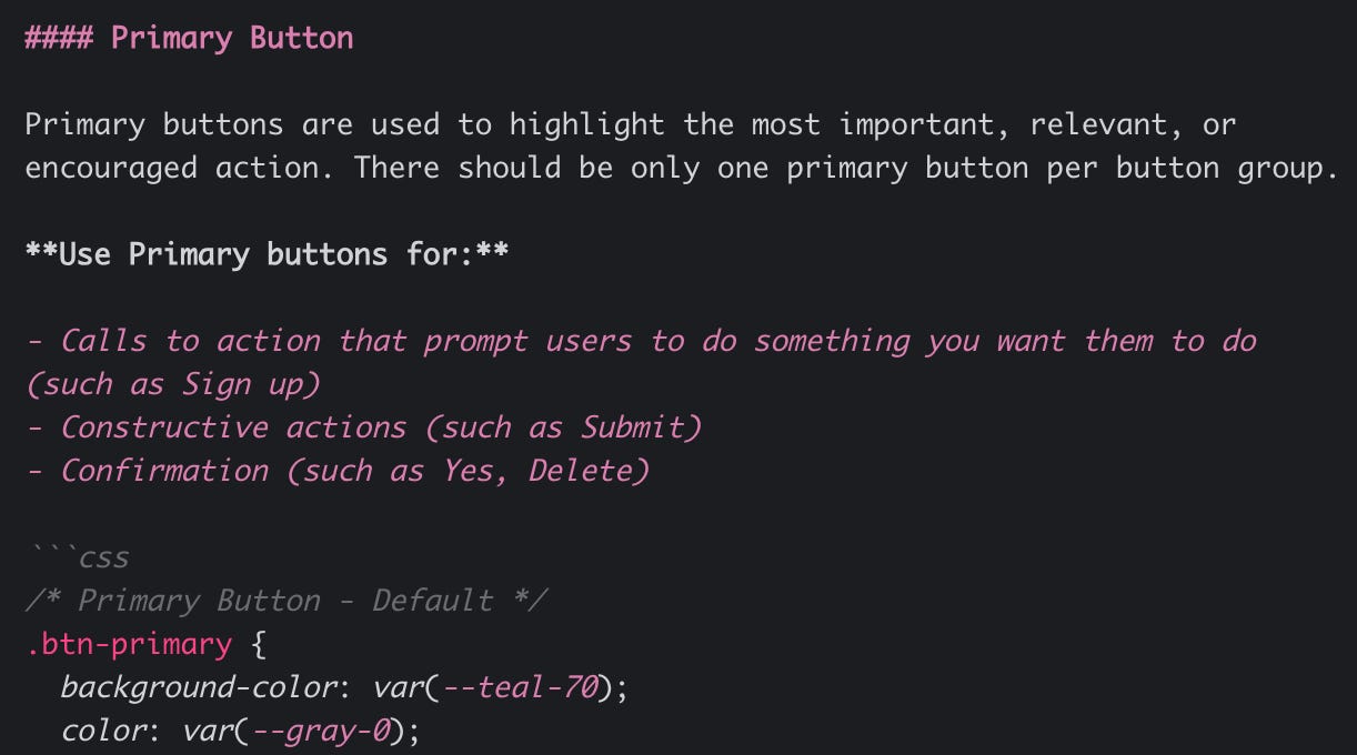
You won’t faithfully represent all of your components using this system. Where it tends to work well is common, low-level components such as buttons, checkboxes, and toggles—enough detail to improve the branding of your prototypes.
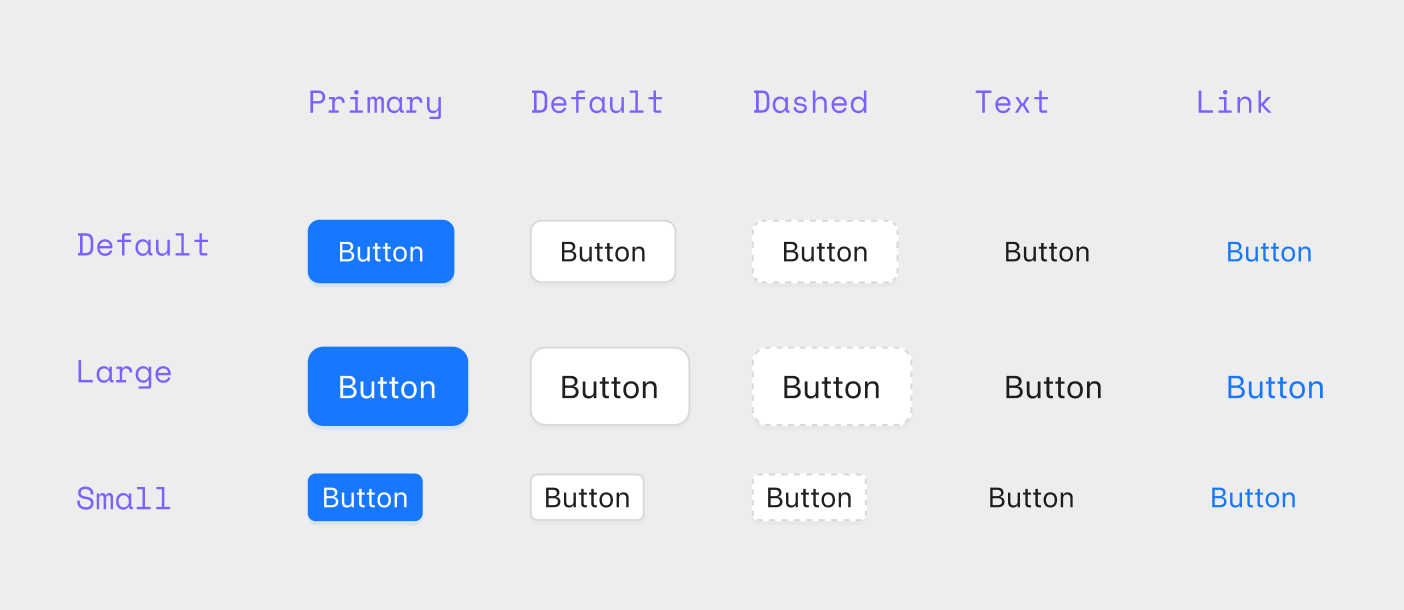
Example of a button in a Figma library The workflow is similar to tokens: copy/paste images from your component library and ask Cursor to recreate the component definition, including variants and states. If the component props are outlined in the source images (variant names, sizes, booleans), ask it to include those as well.
How to use it
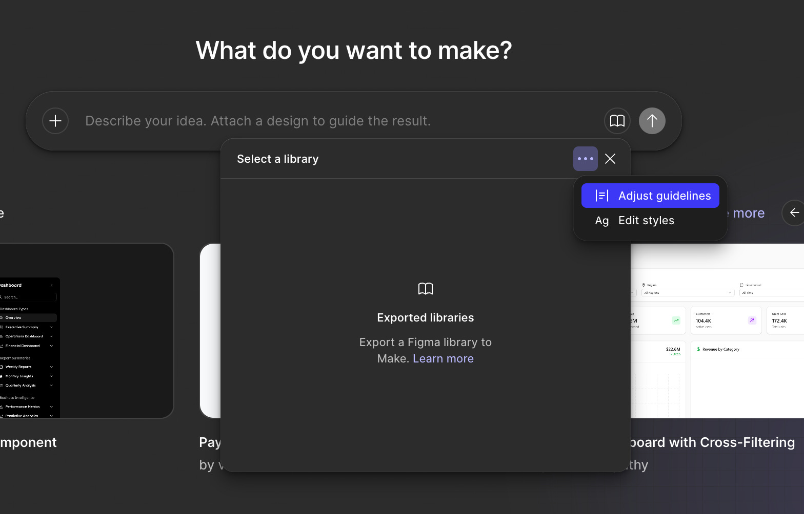
Here’s the fun part. Let’s say I’m working in Figma Make and I want to create a prototype that looks like my app.
Start a new Figma Make project.
Click on the library icon in the prompt, choose the more menu and select
Adjust guidelines.Paste your portable design system into the text box.
Go to the chat box and enter the following prompt:
Replace global CSS styles with the tokens defined in the `Guidelines.md` file. Also update existing / add new components that are defined in that file.
You should now have a template preloaded with your styles. The way I like to test how well it did is with the following prompt:
Create a demo page with all of the design tokens and components I just added or updated. Be complete.
Limitations
Great for design tokens (e.g., colors, typography, spacing), very good for common components, not good for bespoke components
Depends on your existing design system documentation. If it’s good, you can build a workable portable design system quickly.
When starting a new project this way, give yourself extra time to build the base template from your portable design system.
There’s not a great way to keep this file up to date. My recommendation is to revisit this process after major changes to your design system.
Closing
If you’re building prototypes with code-gen tools and you want them to look like your product—not a generic template—this is an easy constraint to add. Start with tokens, add a few core components, and iterate until your “demo page” reads like your system.
The best part is that it’s portable: one file can travel with you across tools, projects, and experiments.
This makes sense and is something that I hadn't considered deeply before. I've been throwing, " just use DaisyUI components for this" but I know that that isn't a design system, nor is it a paradigm or a process.
You mentioned cursor a bunch in here, but I have to recommend trying Claude opus 4.5. at the moment there is nothing else in the world that does what it does.